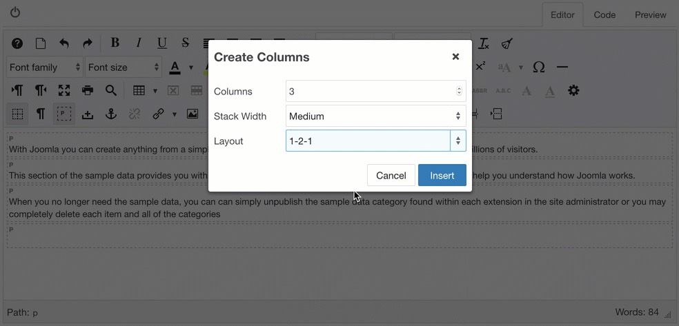
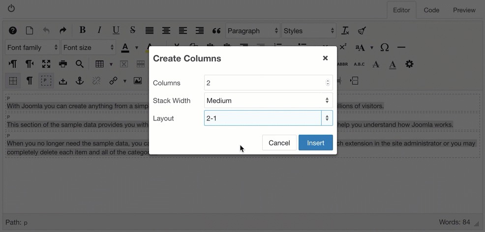
To set a Columns parameter, go to Editor Profiles -> Plugin Parameters and click on the Columns tab.
There are 2 parameter options available, one for setting the default Stack Width, and the other for selecting the CSS framework to use for styling the columns.

CSS Framework
By default, Columns uses a generic set of FlexBox styles to create columns. These are loaded in the front-end by the System - JCE plugin so that content created using these styles will display correctly. You can view the full set of classes used on the JCE Gitub Repository.
If you are using a template that uses CSS framework, like Yootheme's UIKit (all Yootheme templates) or Bootstrap 4, you can select this framework to use instead of the generic css styles.
Stack Width
The stack width is the width of the browser window at which the columns will be stacked vertically, and is based on 3 device sizes :
- Small - phone sized devices in landscape mode at a width of between 576px (Bootstrap) and 640px (Yootheme UIKit and Generic)
- Medium - tablet devices in landscape mode at a width of between 768px (Bootstrap) and 960px (Yootheme UIKit and Generic)
- Large - laptops and desktops at a width of between 992px (Bootstrap) and 1200px (Yootheme UIKit and Generic)
Select the Stack Width to use for all new columns. The default is Medium.
Creating and editing columns
The Columns tool creates a horizontal row of any number of columns, that can contain any type of content. The columns are responsive, and are sized either according to the number of columns in a row or using a set of predefined layouts. They can be set to stack vertically on smaller screens and mobile devices, based on the device width.
Columns can be created by wrapping existing content, such as a collection of paragraphs, or by inserting new empty columns using the Create Columns tool.
Creating columns with existing content
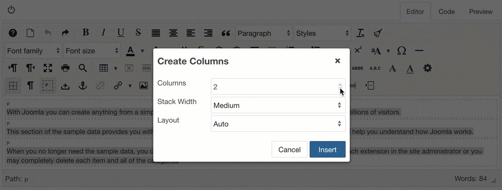
- Select the content to wrap in columns. In the example below, two paragraphs are selected using a drag selection.
- Click on the Create Columns button to open the dialog.
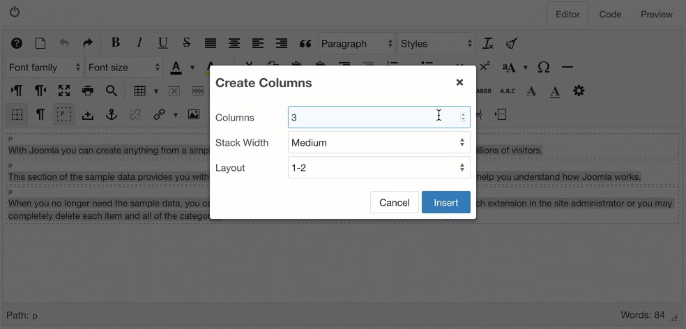
- The Columns field display the number of columns that will be created. This defaults to the number of block elements (in this case paragraphs) selected, or the default value set in the Columns parameters.
- The number of columns can be changed. In this example, we add an extra column, for a total of 3. The extra column will be inserted at the end of the row.
- Click Insert to create the columns.
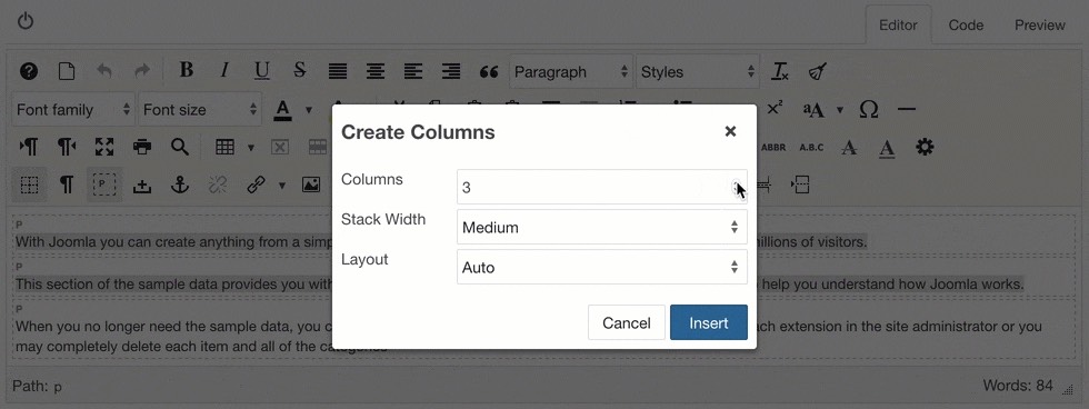
The number of columns can also be set to a value lower than the number of blocks selected. When this is done, the blocks are distributed evenly to each of the columns. In the example below, the 3 paragraphs selected are allocated to only 2 columns, so the first 2 paragraphs are assigned to the first column, and the last paragraph to the second column.
Creating new columns
New columns can be created either by using the grid tool, or the Create Columns dialog.
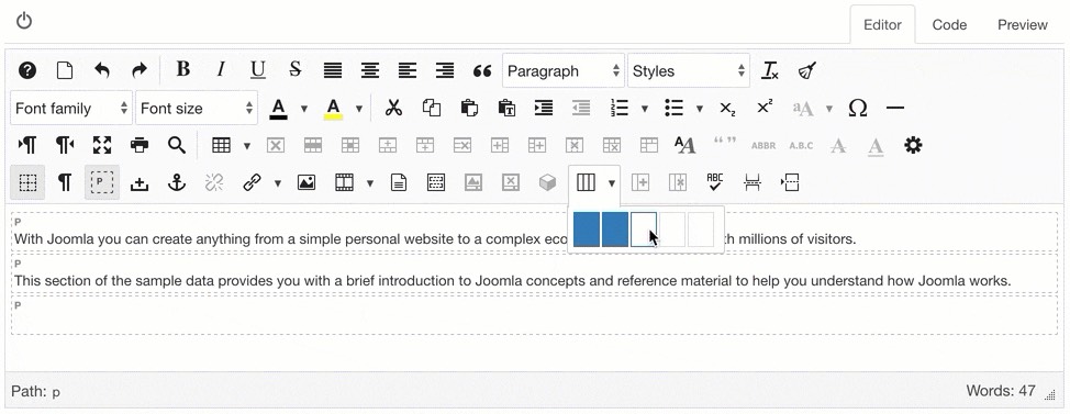
To use the grid tool, click on arrow next to the Create Columns button, and mouseover the grid boxes to select the number of columns to create. Up to 5 columns can be created in this way.
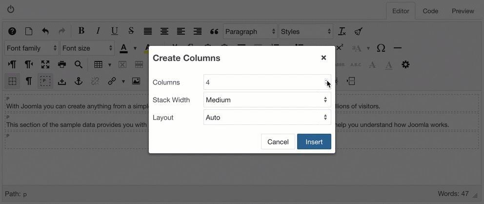
To create columns with the dialog, click in the editor where you want the columns to be inserted, then open the Create Columns dialog. Set the number of columns to be created and click the Insert button.
Adding and removing columns
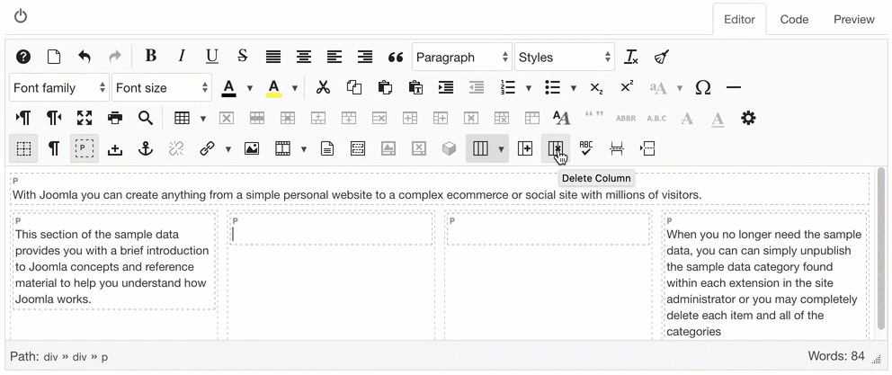
Columns can be added or removed from a row after they have been created, using the Add Column and Delete Column buttons.
To add a column, click in the column you want the new column to be added after, then click the Add Column button. A new column will be created with each click of the button.
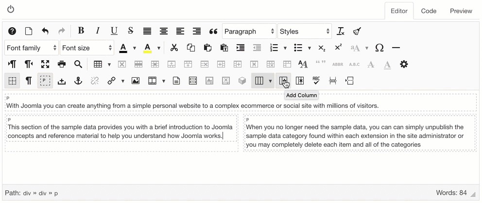
To delete a column, click in the column to be deleted, then click the Delete Column button. If the column contains some content, this will be moved outside of the column row, either before or after the row, depending on its original position in the row.
Stacking columns
Columns a responsive and will resize based on the browser width, but it is sometimes preferable to stack columns vertically when viewed on smaller devices.
Columns are not set to be stacked by default, but the default Stack Width can be set in the Columns parameters, which will be applied to all new columns created.
The Stack Width can also be set when creating a new row of columns with the Create Columns dialog, or when editing an existing row.
The width at which the columns will be stacked - the Stack Width - is based on 3 device sizes :
- Small - phone sized devices in landscape mode at a width of between 576px (Bootstrap) and 640px (Yootheme UIKit and Generic)
- Medium - tablet devices in landscape mode at a width of between 768px (Bootstrap) and 960px (Yootheme UIKit and Generic)
- Large - laptops and desktops at a width of between 992px (Bootstrap) and 1200px (Yootheme UIKit and Generic)
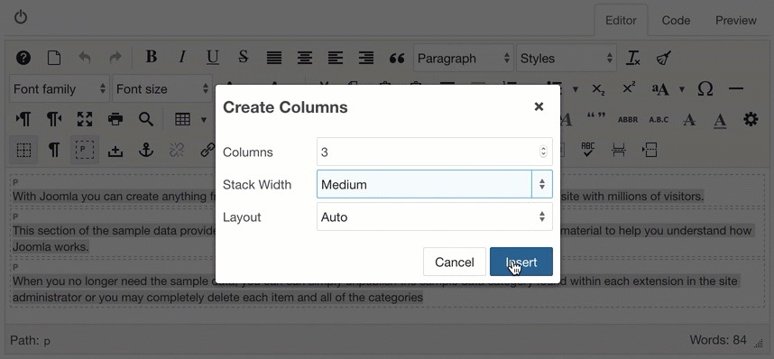
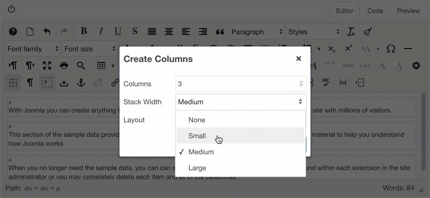
To set the Stack Width, open the Create Columns dialog and select the desired size from the Stack Width list. Click Insert or Update to apply the width.
In the example below, a Medium Stack Width is set, which causes the columns created to be stacked, due to the current width of the content. When the editor window is enlarged, the columns align horizontally.
In the example below, the columns are edited and a new Stack Width is set, resulting in the columns only stacking when the content is resized to 640px or lower.
Creating columns using a Layout
When creating new empty columns, or creating columns with existing content, the columns are sized equally to fit the width of the browser window. The Layout list in the Create Columns dialog provides a list of predefined layouts for setting the widths in thirds and fourths, where one column is given a width value of ½, ⅔ or ¾ of the row, with the other columns filling the remaining width. The Layout list contains the following options:
- Auto : the default value. Each column has an equal width
- 2-1 : The width is set in thirds, with the first column as two thirds of the total width.
- 1-2 : The width is set in thirds, with the last column as two thirds of the total width.
- 3-1 : The width is set in quarters, with the first column as three quarters (75%) of the total width.
- 1-3 : The width is set in quarters, with the last column as three quarters (75%) of the total width.
- 2-1-1 : The width is set in quarters, with the first column as one half (50%) of the total width. This is usually applied to rows of 3 columns or more.
- 1-2-1 : The width is set in quarters, with the middle column as one half (50%) of the total width. This is usually applied to rows of 3 columns or more.
- 1-1-2 : The width is set in quarters, with the last column as one half (50%) of the total width. This is usually applied to rows of 3 columns or more.
When a Layout is selected for a new row of columns, a default number of columns associated with each layout will be created. As a specific width value is only set on one column within the row, a layout can be applied to any number of columns.
